COVID-19 Impact Analysis Dashboard
Project Overview
- Project Type: Data Visualization & Analytics
- Platform: Tableau Desktop (Dashboard published on Tableau Public)
- Data Source: Publicly available WHO COVID-19 Dataset
- Project Focus: Global pandemic trends, case and death analysis, geographical impact
- Key Techniques: Data Cleaning, Trend Analysis, Geospatial Mapping, Interactive Dashboard Design
- Timeline: Completed Dec 2023
- Live Dashboard: View on Tableau Public
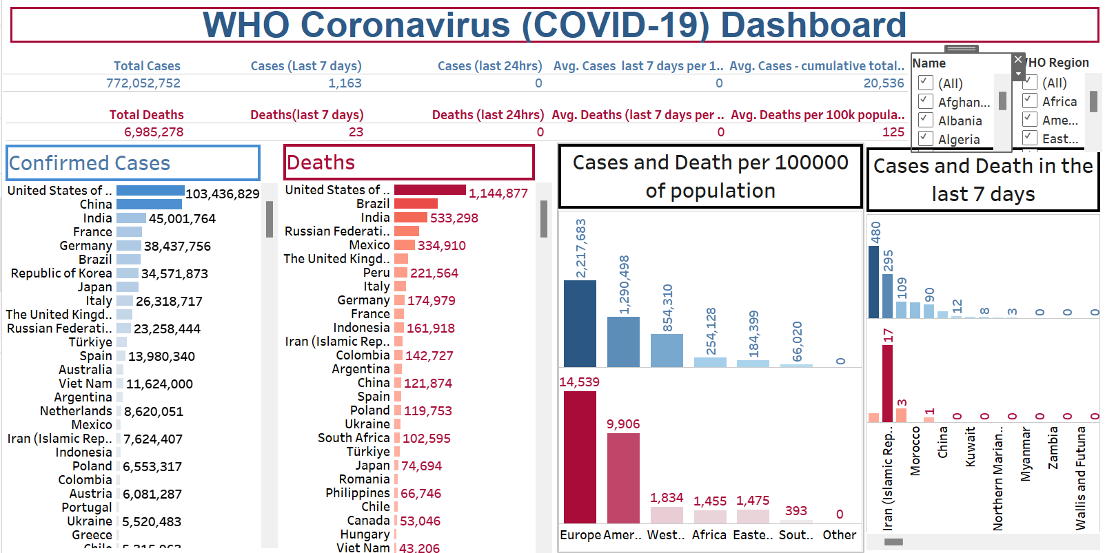
The COVID-19 Story: Unveiling Insights with Data
The early days of the COVID-19 pandemic brought global uncertainty, demanding a clear understanding of its rapid spread. As a data professional, I felt compelled to illuminate this crisis, transforming raw numbers into a meaningful narrative.
From Chaos to Clarity: My Data Journey
My work began with the extensive WHO COVID-19 dataset, a vast but unstructured collection of global cases, deaths, and vaccination figures. The first crucial step was data preparation, meticulously cleaning and transforming this raw data into a usable foundation. Following this, Exploratory Data Analysis (EDA) allowed me to uncover initial patterns and formulate key questions, guiding the direction of my project.
The heart of this endeavor lay in Tableau Desktop. Here, I connected the prepared data, crafted calculated fields for vital metrics, and designed an interactive dashboard. This wasn't merely about visualizing data; it was about creating a dynamic tool. Users could effortlessly filter by Country/Region or Date, observe daily trends in cases and deaths, explore the global spread through a geographic map, and track vaccination progress. Through this process, key findings emerged:
The dashboard clearly illustrated distinct waves of infection across different periods, demonstrating the pandemic's cyclical nature. It highlighted regions with significantly higher case concentrations, pinpointing areas that bore the brunt of the virus. Furthermore, a visual correlation was evident between accelerated vaccination efforts and a subsequent flattening or decline in new cases and deaths in various areas, showcasing the positive impact of public health interventions. The interactive nature of the dashboard allowed for granular exploration, enabling users to pinpoint specific countries and observe their unique pandemic trajectories and recovery patterns.
The dashboard, now live on Tableau Public, became a powerful lens for dynamic data exploration and understanding these critical results.
Impact and Conclusion: Data-Driven Understanding
This Tableau dashboard provided immediate, critical insights derived directly from the analysis: revealing distinct pandemic waves, highlighting regional disparities in impact and recovery, and showcasing the widespread global effect of the virus. More than just a collection of charts, it serves as a valuable resource for enhanced situational awareness, identifying trends and hotspots, supporting policy formulation, and fostering public education and transparency.
By transforming complex WHO data into clear, interactive insights, this project demonstrates my strong command of data analysis principles and robust skills in Tableau. It underscores the vital role of data visualization in navigating and understanding global health crises, empowering informed decision-making for a healthier future.