Pizza Sales Dataset Analysis
Project Information
- Category: Sales Analytics / Foundational Data Visualization
- Client: Quantum Analytics (First Internship Project)
- Project Date: Sept 2023
- Tools Used: Tableau, Microsoft Excel
- Data Source: Sample Pizza Sales Dataset
- Project URL: View on Tableau Public
Pizza Sales Dataset Analysis: My First Steps in Data Visualization
Summary
As my inaugural project at Quantum Analytics, the Pizza Sales Dataset Analysis was where I took my first exciting steps into data visualization with Tableau. This project focused on exploring a straightforward dataset to uncover basic sales patterns, identify popular pizza types, and understand revenue trends. It was a hands-on opportunity to grasp Tableau's interface, learn to connect data, create simple charts, and build my very first interactive dashboard. This project was crucial in building my foundational skills and confidence in turning raw data into clear, actionable insights.
1. Introduction: Discovering Insights with Pizza Data
Starting my internship at Quantum Analytics, I was eager to apply theoretical knowledge to real data. The Pizza Sales Dataset provided the perfect entry point. It was my chance to move beyond concepts and directly engage with a dataset in Tableau. The goal wasn't complex analysis, but rather to learn the fundamentals of data visualization: how to connect data, drag and drop fields, create basic charts, and then combine them into a simple, coherent dashboard. This project was about understanding data structure, identifying initial questions, and seeing how visual analytics could provide answers quickly. It was where I truly started to see data as a story waiting to be told.
2. Project Objectives & Goals
My primary objectives for this foundational project were focused on building core Tableau skills:
Overall Objectives:
- Understand the structure of a typical sales dataset.
- Learn to connect raw data to Tableau effectively.
- Create basic charts to visualize sales trends and product performance.
- Identify initial insights, such as best-selling pizzas or peak sales times.
- Practice assembling multiple visualizations into a single, interactive dashboard.
Project Goals & Deliverables:
- Sales Trend Chart: A visualization showing daily/weekly/monthly sales performance.
- Top N Products Chart: A bar chart identifying the most popular pizza types or categories.
- Revenue Distribution: A chart showing how sales contribute across different pizza sizes or order types.
- Basic Interactive Dashboard: A simple dashboard combining these visualizations for easy exploration.
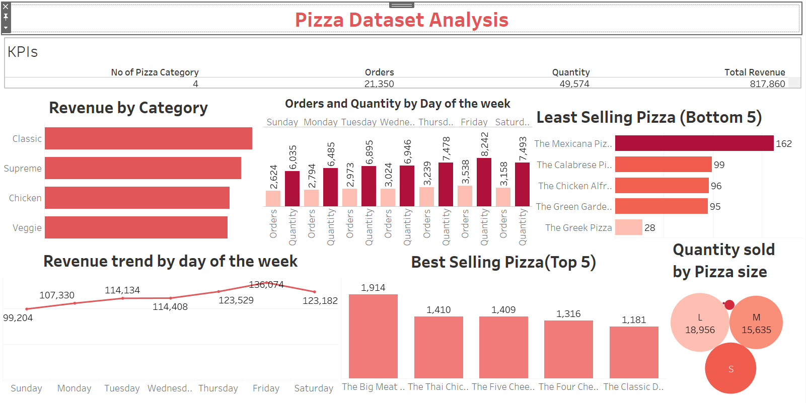
3. Data Scope & Metrics
The project utilized a sample pizza sales dataset, which was relatively clean and well-structured, making it ideal for a first Tableau exercise. The dataset likely contained core sales metrics such as: Order ID, Date, Time, Pizza Type, Quantity, Price, and potentially Pizza Size or Category. My focus was on using these basic fields to calculate total sales, average order values, and counts of specific pizza types. This clear dataset allowed me to concentrate on learning Tableau's functionalities rather than extensive data cleaning, providing a smooth introduction to the visualization process.
Key Insights Derived from Data:
- Identified Top-Selling Pizzas: Quickly saw which pizza types were the most popular.
- Understood Sales Trends: Observed daily or weekly patterns in pizza orders.
- Recognized Peak Order Times: Found out when the most pizzas were sold.
- Learned Basic Revenue Drivers: Understood how quantity and price influenced total sales.
- Gained Confidence in Data Exploration: Realized how quickly insights can be found with visual tools.
4. Dashboard Design & Key Insights
My first Tableau dashboard for the pizza dataset was designed to be straightforward and informative, showcasing key sales aspects:
Dashboard Features and Insights:
- Sales Over Time Chart: A simple line chart illustrating daily or monthly revenue fluctuations.
- Popular Pizzas Bar Chart: A bar chart displaying the sales quantity or revenue for different pizza types.
- Sales by Size/Category Chart: A breakdown of sales contribution across various pizza sizes or categories.
- Basic Filters: Date filters to narrow down the analysis to specific periods.
- Clear Labels and Titles: Ensuring that each visualization was easy to understand.
This dashboard was a milestone, demonstrating my ability to combine multiple charts into a cohesive view and effectively communicate initial business insights.
5. Technical Approach & Tools
The technical approach for this project was all about learning the ropes of Tableau:
- Data Acquisition: The dataset was provided, likely in a flat file format (e.g., CSV or Excel).
- Data Connection (Tableau): My first experience connecting a raw data file to Tableau Desktop.
- Basic Chart Creation (Tableau): Learning to use different chart types (bar, line) by dragging and dropping dimensions and measures.
- Dashboard Assembly (Tableau): Combining individual worksheets onto a single dashboard, setting up filters, and understanding layout.
- Exploratory Data Analysis (EDA): Simple analysis within Tableau to check data types, identify missing values, and understand basic distributions.
6. Impact & Business Value
While a beginner project, the insights gained from this analysis hold real value:
- For a Business Owner: Quick insights into best-selling products, helping with inventory and marketing decisions.
- For Operational Planning: Understanding peak sales times could inform staffing and ingredient stocking.
- Demonstrates Foundational Skills: Showcases the ability to connect to data, create basic visualizations, and build a simple dashboard.
- Builds Analytical Confidence: A successful first project instills confidence in tackling more complex data challenges.
- Storytelling with Data: Even at a basic level, it illustrates the power of data to reveal patterns and tell a story about business performance.
7. Conclusion
My Pizza Sales Dataset Analysis project was an exciting introduction to the world of data visualization at Quantum Analytics. It taught me the foundational steps of using Tableau—from connecting data to building my first interactive dashboard. This project solidified my understanding of how data can directly reveal business insights, even from a simple dataset, and significantly boosted my confidence to pursue more advanced analytical challenges.